Case Study
LiveOps Design
Rethinking how Candy Crush delivers content to players and building a design system that scales.
Rethinking how Candy Crush delivers content to players and building a design system that scales.
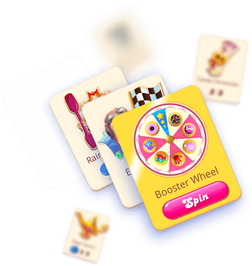
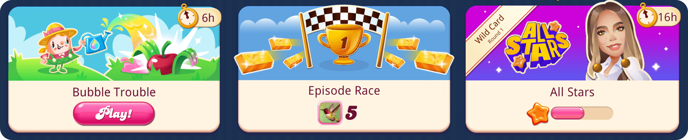
An image is worth a thousand words, so let's start with this:
If you'd rather have the words—get comfy, take a sip of water, and keep scrolling.
The cards' varied designs revealed an underlying issue: teams competing for users' attention. Candy Crush offers many extra features ("events") alongside the main game. Without an organized way to communicate, each team created their own solutions, resulting in a noisy, inconsistent interface. Our main challenge became to create a structured system for teams to effectively communicate with users and deliver content.
As the organization grew rapidly, we needed to eliminate repetitive work for developers and artists when creating new events.
Usability tests showed users struggled to get information at a glance, often feeling overwhelmed and ignoring the page entirely.
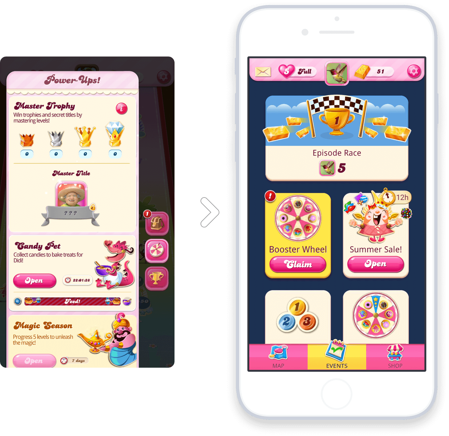
I started with the core element: the card. Exploring its information architecture was crucial to uncover communication gaps and determine what users needed at each stage of their journey. Here are some early designs:
IWorking with UX designers and researchers, we quickly put concepts in front of users. I helped create interface directions and interactive prototypes to test our assumptions and refine designs. This process helped us determine optimal information display, card design, and page navigation.
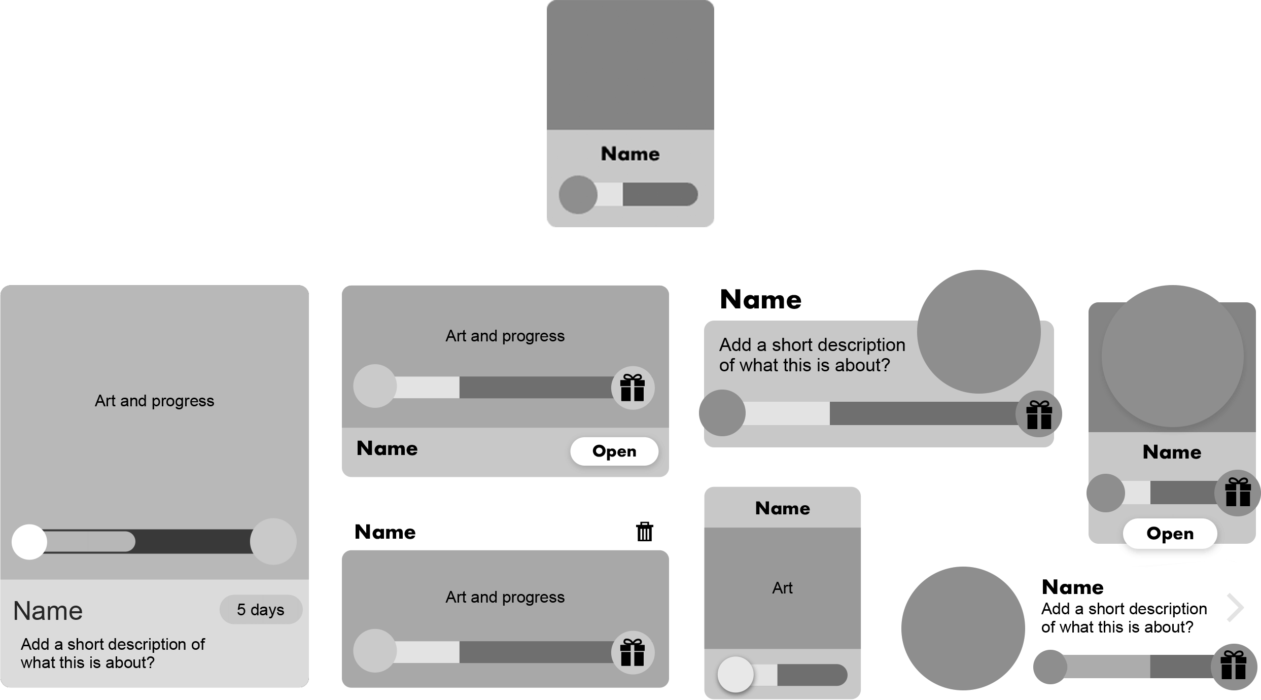
A key concept I introduced was giving cards different states, providing players with a better sense of structure and progress.
These are some of the templates I've created for each state.
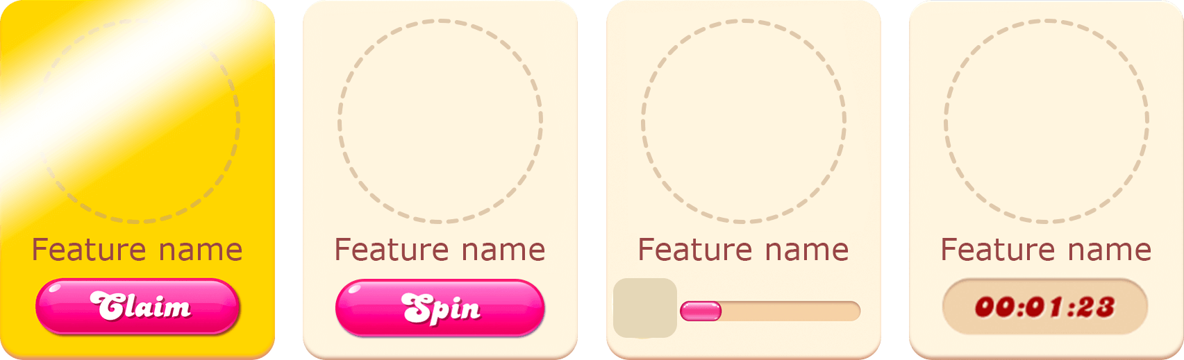
With all cards sharing a similar structure, the page became predictable but boring. This was actually beneficial—when everything screams, nothing is heard. We created ways for important content to stand out:
The golden card - Easily spotted, it tells players they can claim a reward.
Spotlight placement - A unique, double-sized card at the top allowing animation and background image. The catch? Only one at a time, forcing the business to prioritize.
These are examples of the fantastic work that production teams have done applying the design system to their features.
We implemented the new format ourselves, as feature teams couldn't halt production. This allowed us to test, polish, and optimize our system in real-time. I worked directly with the game engine and developers to bring the project to life.
The result? A system working like clockwork, valuable hands-on experience to share, and a solid foundation for the product.
I often presented our progress at all-hands meetings, sharing the reasoning behind design decisions and elevating design maturity in the organization. This experience led to comprehensive design documentation and implementation guides for our teams.
This project was made possible by a fantastic team passionate about delivering a great game. While this case study focuses on my contributions, many talented individuals played crucial roles throughout.
I hope you had an enjoyable reading, and if you still have a little bit of time, I'd like to invite you to visit some other projects, or even my Playground section where you can mindlessly scroll through colorful pictures :D
Thanks!