Case Study
Candy Crush
Redesigning the main navigation of a legendary mobile game. Improving usability for players and flexibility for the product.
Redesigning the main navigation of a legendary mobile game. Improving usability for players and flexibility for the product.
This project was all about giving Candy Crush's main navigation a much-needed facelift. We aimed to future-proof it for growth and make it a breeze for players to use. Check out this before-and-after comparison – there are over a dozen changes. How many can you spot?
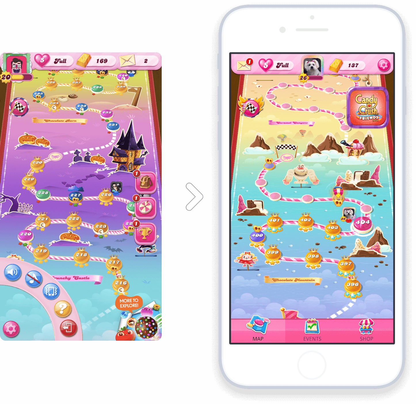
Now, you might be thinking, "Moving a few buttons around? Big deal." But when you're dealing with a decade-old game that's the cash cow of a major company and has millions of die-hard fans – every pixel matters.
If you're curious about how I tackled this challenge, grab something to drink and let's dive in!
The game interface lacked basic design conventions and good practices that makes a product easy to use. Usability tests showed that users struggled and hesitated to navigate the game.
The product was expanding fast, but the cluttered interface was holding it back. We needed a design that could grow with the game's ambitions.
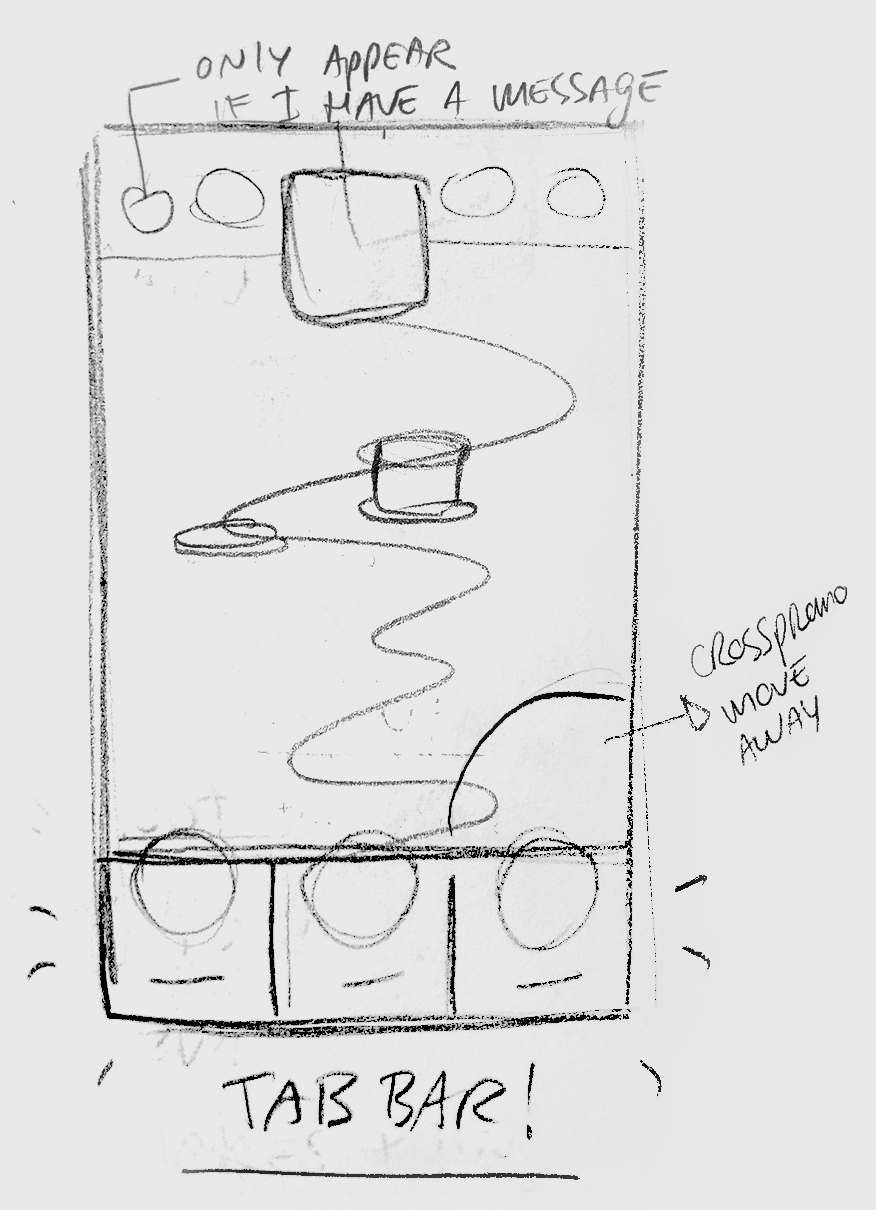
I'm one of those designers who's always scribbling ideas in a sketchbook. From day one at the company, something about the main page structure bugged me. So, I kept exploring and chatting with colleagues about it. Looking back, it's pretty cool to see how those early doodles weren't far off from our final solution.
Every now and then, our company hosts these awesome in-house hackathons. I used these chances to push my designs further and showcase the potential improvements. It was like turning on a light bulb for many folks – suddenly, they could see the issues with the current version.
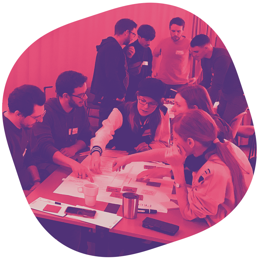
At a company offsite, I facilitaded a design workshop focused on the navigation. Turns out, people were itching to play designer! We had folks from all departments show up, eager to flex their creative muscles. Not only did it open eyes to how deep some of the problems were, but it also gave everyone a chance to brainstorm solutions.
Fast forward one year, and what once was just interface annoyances turned into big roadblocks. When leadership decided it was time for a change, I was ready with a treasure trove of materials that I've done over time. I jumped in headfirst, proving that sometimes the design process starts way before the company realizes it needs it.
One of our first moves was to strip away the visuals and dive deep into the information architecture. It was like doing an x-ray on the game – we could finally see all the broken bones in the structure.
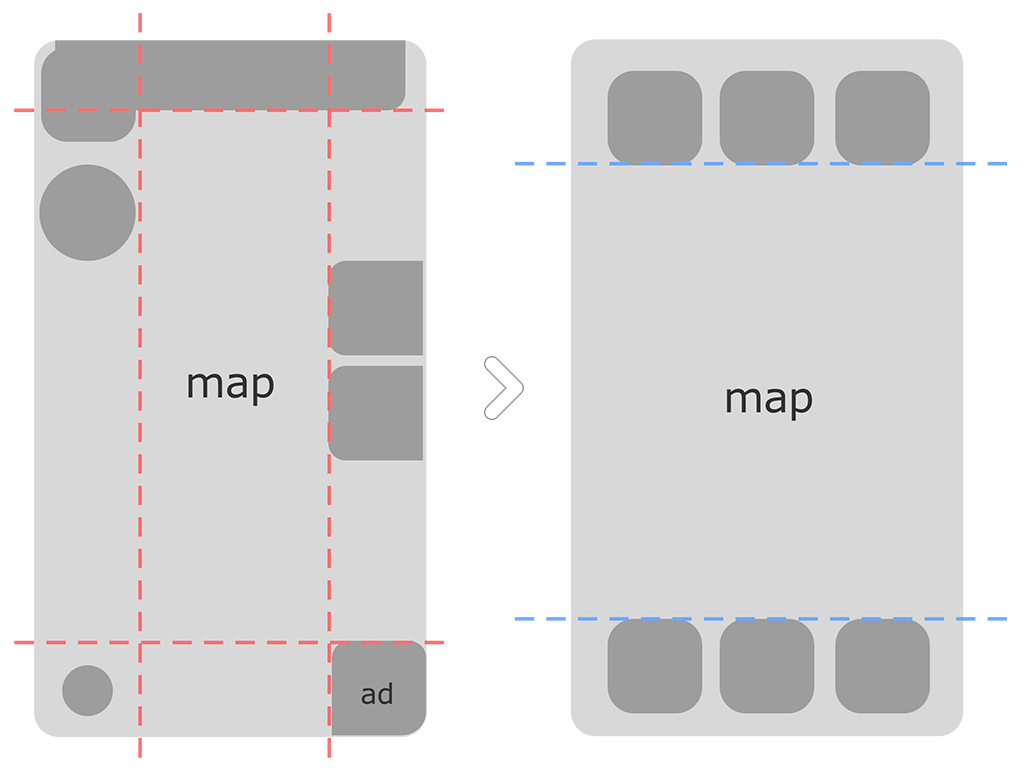
We reorganized elements based on how players interact with them. Stuff players need to know but don't touch often? That went up top. Things they use daily? Those landed at the bottom, right where thumbs naturally rest.
This project wasn't about reinventing the wheel. We built on mental models players already have from using their phones every day. The goal? Make the interface feel so natural that players forget it's there and focus on having fun playing.
Working with our awesome UX designers and researchers, we set up a ton of testing sessions with real players. I whipped up prototypes, and we put them through their paces. The result? Our new navigation was a massive hit in terms of usability. We didn't stop there – we even tested icons and labels to make sure everything was crystal clear.
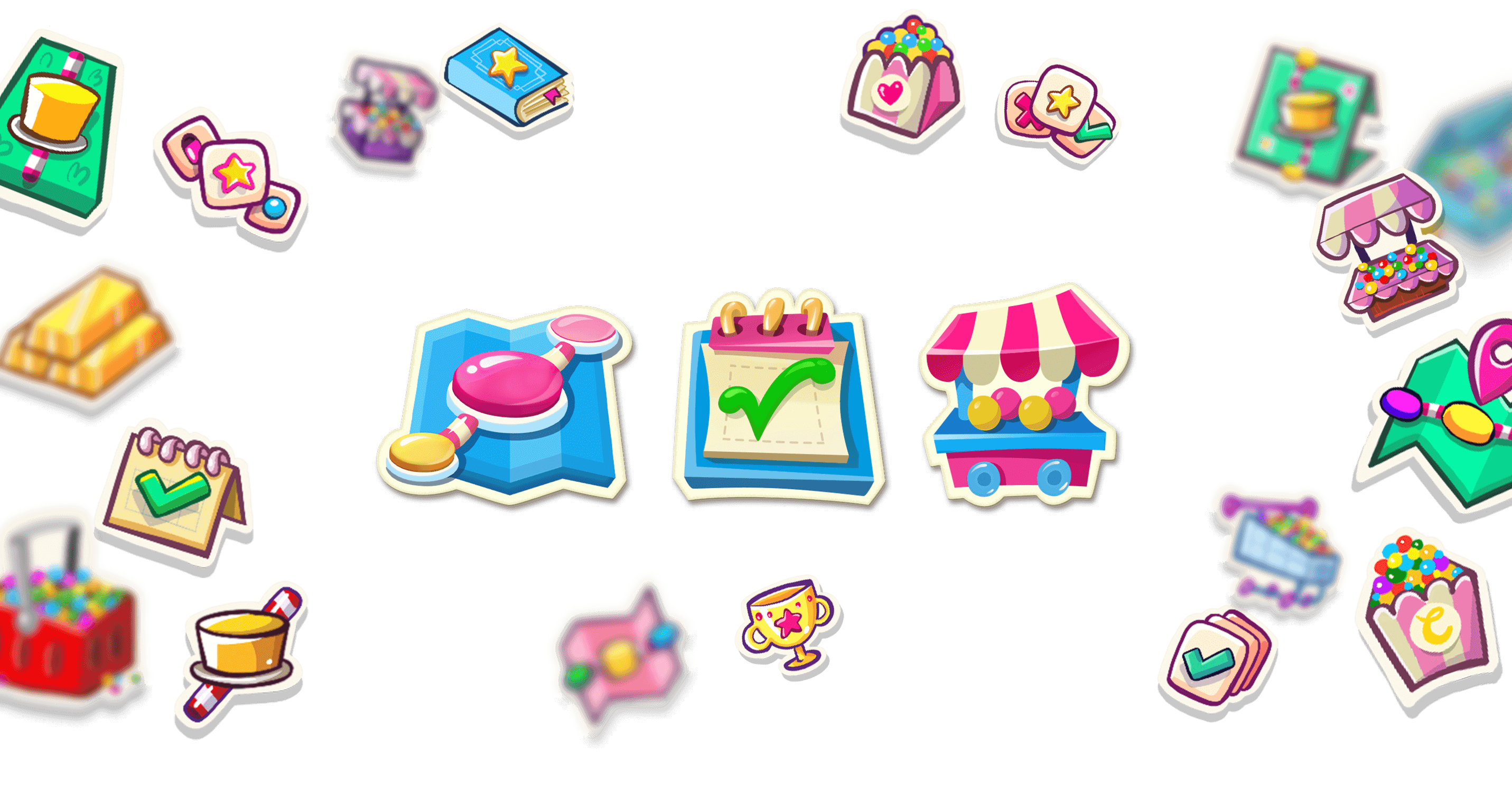
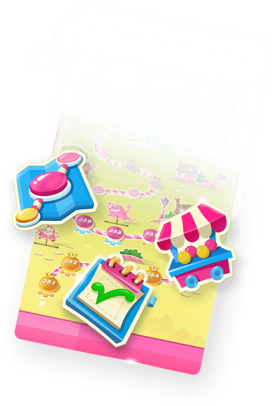
Final icons in the center, surrounded by some of the hundreds of sketches that I drew for research.
With so many moving parts, we couldn't just dump everything on players at once. Even positive changes can be jarring if they come out of nowhere. So, I teamed up with our Product Manager to slice the project into manageable chunks. Each sprint brought us closer to our goals while keeping the player experience smooth.
Every phase had to be A/B tested with rigor.
The work doesn't stop when you hit "ship." We had to get everyone on the same page internally and communicate our vision to the wider team.
I wrote up detailed design documentation covering all aspects of the new direction. This became crucial in guiding decisions about which features deserved prime real estate in the navigation. It also helped spread design knowledge across teams, reminding everyone that our interface is a reflection of our product strategy.
Phew! You've made to the end. Hope you had a good time. This project was a team effort of epic proportions, involving everyone from Product Managers and Agile Coaches to Data Analysts, UX Designers, Researchers, Design Leaders, Art Directors, and a rockstar group of Developers. I learned so much from each of them.
What I've shared here is just my piece of the puzzle. Every person involved could tell you a whole other story.
Thank you very much If you still have a little bit of time, I'd like to invite you to visit some other projects, or even my Playground section where you can mindlessly scroll through colorful pictures :D